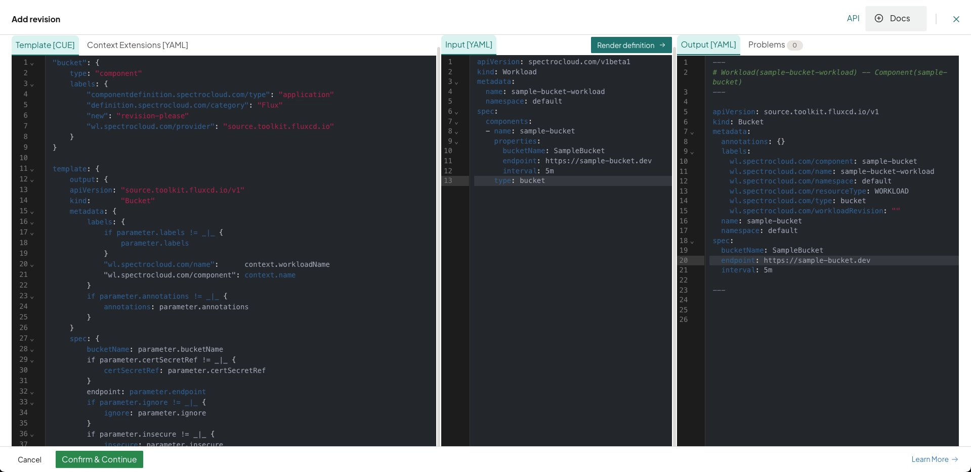
Build Definitions
PaletteAI's definition playground is where you can create and edit Definitions. It provides a three-pane user experience similar to the Helm Playground. Each pane in the playground plays a specific purpose:
-
The left pane contains CUE code that implements a particular definition, and a second tab for defining optional context extensions.
-
The center pane contains a
WorkloadYAML document containing a reference to the definition in the left pane and inputs for the same. -
The right pane contains the final Kubernetes resources rendered from the
Workloadin the center pane, relying on the definition from the left pane and possibly other, preexisting definitions.
Any definition saved from the playground is applied to the hub cluster and available for use in a Workload Profile.
Whenever an existing definition is edited and saved from the playground, a new version of that definition is published to the hub. This action may or may not trigger automatic updates to end-user workloads. Check out the Versioning section for further details.
CUE Tag Conventions
Add the following tags to CUE field definitions where applicable. Tags are appended to the +usage comment and control UI visibility, conditional requirements, default behavior, and more, without cluttering helper text.
Syntax
// +usage=<helper text> [[Tag1: value]] [[Tag2: value]]
fieldName: type
Example: Multi-Tag Usage
The following is an example of a +usage comment with multiple tags.
// +usage=Set toleration duration in seconds [[ShowIf: .effect=="NoSelect" || .effect=="PreferNoSelect"]] [[EmptyTip: tolerates forever]] [[Tooltip: Leave empty to tolerate taint indefinitely. Duration is counted from the taint's TimeAdded field, not from when the toleration is set or the cluster is scheduled.]]
With the above tags, the following modifications would be applied to the fieldName field on the PaletteAI UI.
-
Is shown when
.effectis"NoSelect"or"PreferNoSelect"(ShowIf) -
Displays
"tolerates forever"as input hint text when empty (EmptyTip) -
Includes a tooltip explaining further behavior and context (
Tooltip)
Supported Tags
The following table summarizes the available tags in PaletteAI. Select a tag for additional information, including how it is used and possible values.
| Tag | Description |
|---|---|
| DefaultFrom | Sources the default value from another field. |
| EmptyIf | Prevents configuration of this field if a condition is true. Used for mutual exclusivity. |
| EmptyTip | Adds italic placeholder text to the input field to indicate default behavior (max 50 characters). |
| ItemTitleFromField | Specifies which field to use as the display title for items in an array. |
| ListType | Modifies how list elements are displayed and grouped in the UI (for example, LogicalOR, LogicalAND). |
| MutualExclusionTooltip | Provides a custom tooltip when a field is disabled due to mutual exclusion. |
| RequiredIf | Conditionally overrides the field's required status, regardless of the base schema. |
| ShowIf | Conditionally shows or hides a field based on a boolean expression. |
| TextEditor | Display a string-typed field as a text editor with language-specific syntax highlighting. |
| Tooltip | Adds hover-over help text for fallback logic, system behavior, or edge cases. |
DefaultFrom
-
Usage:
[[DefaultFrom: <reference>]] -
Description: Sources the field’s default value from another field.
-
If the source field is optional, its default (if any) is used, or its type’s zero value.
-
If the source field is required, its value is used if available.
-
If the target field has already been set by the user, it is not overridden.
-
Once the target is manually edited, it is disconnected from the source.
-
EmptyIf
-
Usage:
[[EmptyIf: <condition>]] -
Description: Defines when a field must not be configured (mutual exclusivity). If the condition is violated, an error is shown indicating the description that failed.
-
Values
-
true- Field must be left empty. When not configured, arrays and strings have a length of zero, and the tag does not apply to booleans, integers, and floats. All object subfields are empty, recursively. -
false- Field can be configured.
-
The EmptyIf tag is incompatible with the ShowIf tag. If both tags are present for a given field, EmptyIf is ignored.
EmptyTip
-
Usage:
[[EmptyTip: <message>]] -
Description: A short, italic placeholder message in an empty input field indicating the default fallback behavior if the field is left blank. The message is displayed in a muted color inside the input field and cannot exceed 50 characters.
ItemTitleFromField
-
Usage:
[[ItemTitleFromField: <reference>]] -
Description: Specifies which field to use as the display title for items in an array.
-
Syntax:
$.fieldName(or$.object.fieldfor nested paths)
ListType
-
Usage:
[[ListType: <type>]] -
Description: Controls the layout and logical relationship between items in a list.
-
Values
-
LogicalOR- UI displays OR between list items. -
LogicalAND- UI displays AND between list items.
-
MutualExclusionTooltip
-
Usage:
[[MutualExclusionTooltip: <message>]] -
Description: Provides a custom tooltip message when a field is disabled due to mutual exclusion (from
EmptyIf). Overrides the automatically generated mutual exclusion tooltip. Use when you want to provide a more descriptive explanation of why fields are mutually exclusive.Example// +usage=Configure Slack notifications [[EmptyIf: .webhookNotifications != null]] [[MutualExclusionTooltip: Choose either Slack integration or generic webhook notifications]]
slackIntegration?: { ... }
RequiredIf
-
Usage:
[[RequiredIf: <condition>]] -
Description: Overrides the required status of a field based on a condition.
-
Values:
-
true- The field is required, regardless of the schema. -
false- The field is optional, regardless of the schema.
-
ShowIf
-
Usage:
[[ShowIf: <condition>]] -
Description: Controls whether the field is visible in the UI based on a condition. Does not affect whether the field is required (
RequiredIftag). -
Values:
true- The field is shown.false- The field is hidden.
The ShowIf tag is incompatible with the EmptyIf tag. If both tags are present for a given field, EmptyIf is ignored.
TextEditor
-
Usage:
[[TextEditor: <language>]] -
Description: Display a string-typed field as a text editor element with language-specific syntax highlighting. For example,
[[TextEditor: YAML]]for theHelmReleasecomponent’s values field.
Tooltip
-
Usage:
[[Tooltip: <message>]] -
Description: Adds a hover-over tooltip with additional information.
Field Reference Syntax in Tag Expressions
When using tags, you may need to reference the value of other fields. The following syntax rules apply.
-
Use
.fieldNameto reference a field within the same object. -
Use
parameter.path.to.fieldto reference a field in a different object or scope (for example, parent-child relationships, cross-parameter references, or nested structures).
Following is an example of how these references are used in tag expressions.
[[ShowIf: .type==true]]
[[DefaultFrom: parameter.placement.decisionStrategy.groupStrategy.clustersPerDecisionGroup]]